DS AppFuzer — Multi-Brand Commerce System
The Complete Design System
Internal documentation that powers three brands and hundreds of live experiences.
A complete, production-ready system for color, type, icons, components, grids, tokens, documentation, and brand storytelling across Lévoit, Cosori, and PawSync.
Built for Scale Components and patterns designed to support new brands, product lines, and campaign moments.
Designed for Clarity Every guideline is written with rationale, examples, and clear implementation guidance.
Trusted by Teams Used by designers, developers, and marketers across three consumer brands.
You have full access to the internal design system. Explore every foundation, component, pattern, and guideline that powers three distinct brand experiences.
Complete color architecture for each brand including palettes, semantic tokens, and real-world applications.
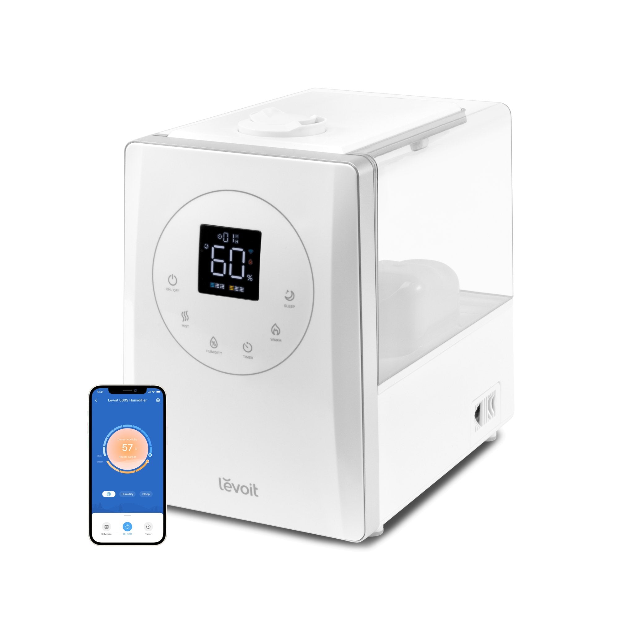
Lévoit Clean · Calm · Trustworthy
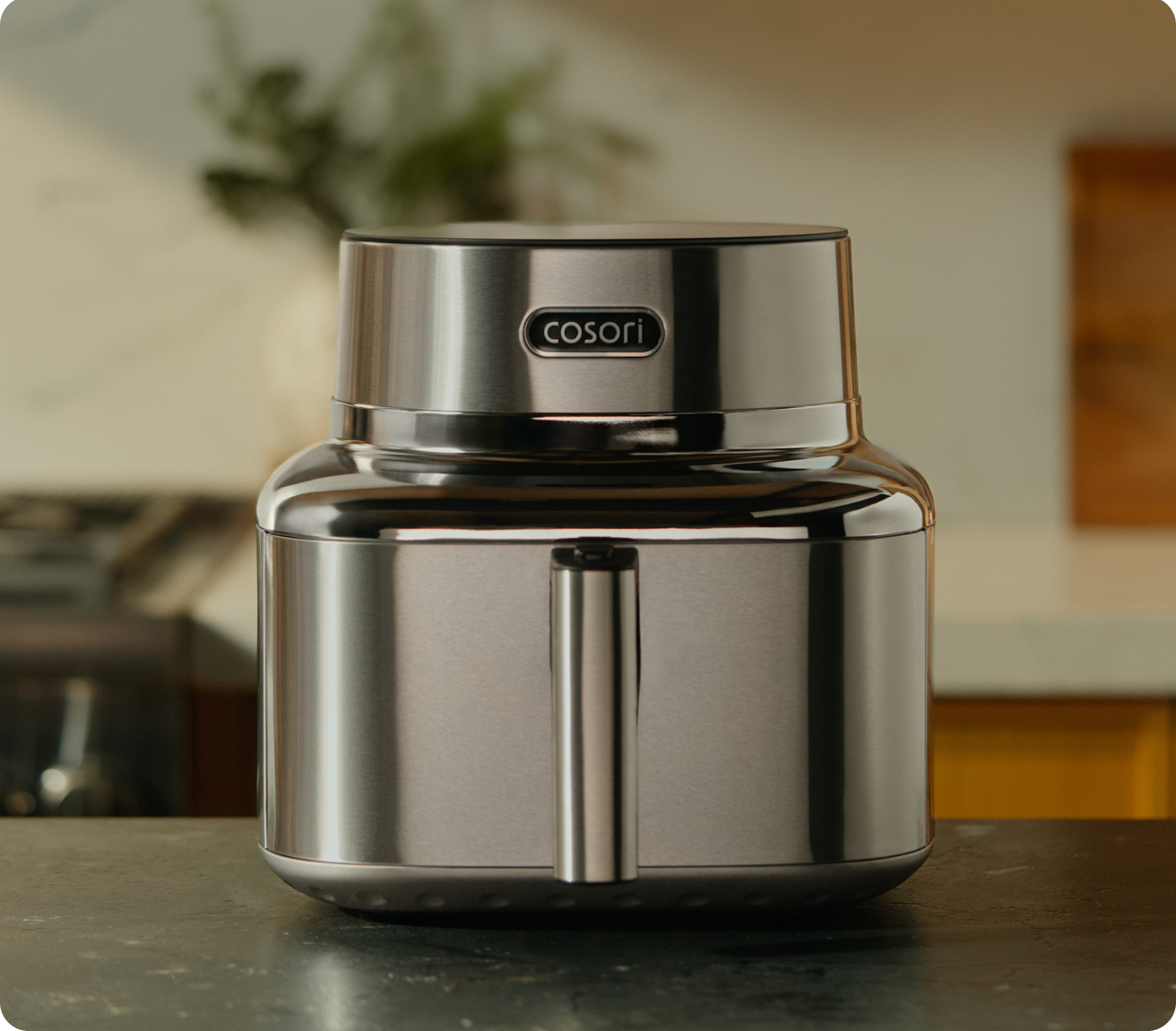
Cosori Warm · Inviting · Energetic
PawSync Friendly · Warm · Approachable
Type scale, hierarchy, and usage guidelines across all three brands.
Type Scale (Poppins)
Ag
H1 48/56 Bold
H2 32/40 Semibold
H3 24/32 Semibold
H4 20/28 Medium
Body 16/24 Regular
Small 14/20 Regular
Caption 12/16 Regular
Usage Examples
Lévoit
Breathe Better.
Smart air quality solutions for every home.
Cosori
Endless Recipes.
Innovative tools and delicious recipes.
PawSync
Stay Connected.
Smart care that brings peace of mind.
8 Documentation Sections
Type Guide Typography Type Uses Type Hierarchy Type Sample 1 Type Sample 2 Copy Usage 1 Copy Usage 2
New consistent outline icon system using shared SVG symbols, proper export names, and brand-safe color mapping.
Grid 24px frame, optical center, 2px padding.
Stroke 1.85px outline, rounded joins and caps.
Naming icon.category.name with semantic aliases.
Color Roles default, muted, active, success, warning, error.
States default, hover, active, disabled, loading.
A11y Decorative hidden; controls need text labels.
Navigation & Account
8 icons
Actions, Commerce & Status
16 icons
Foundations & Documentation
12 icons
Reusable components with variants, states, and usage rules for every brand.
Buttons component.button default hover focus disabled
Navigation component.nav
States active, hover, disabled
Icons 16px system set
Levels primary, nested
Mobile drawer, bottom nav
Tabs component.tabs Tab One Tab Two Tab Three
segmented underline pill vertical
Count 2-5 tabs
Overflow scroll or menu
A11y roving focus
Alert / Banner component.alert Success message saved.
System information.
Review before continuing.
Error message.
Includes component.rules Variants size, tone, intent
States default, hover, active
Usage dos, don'ts, examples
A11y labels, focus, contrast
Complete brand guidelines and applications for each of the three brands.
Lévoit brand.levoit.book Clean · Calm · Trustworthy
Logo & Space clear space, lockups, misuse rules
Typography Poppins hierarchy, calm scale
Photography bright homes, product clarity
Copy Voice calm, proof-led, reassuring
Applications homepage, PDP, retail, email
Usage Rules approved examples and do nots
Tokens Imagery Examples
Cosori brand.cosori.book Warm · Inviting · Energetic
Logo & Space badge, lockup, contrast rules
Typography Poppins hierarchy, bold recipe cues
Food Imagery warm kitchens, recipe moments
Copy Voice inviting, sensory, confident
Applications recipes, PDP, campaign, email
Usage Rules offer lockups and do nots
Recipes Offers Examples
PawSync brand.pawsync.book Friendly · Warm · Approachable
Logo & Space friendly marks, safe zones
Typography Poppins hierarchy, warm labels
Pet Imagery bond, care, real home context
Copy Voice warm, community, supportive
Applications community, PDP, support, email
Usage Rules proof points and do nots
Care Proof Examples
Grid systems that govern layout across every breakpoint and surface.
TV · 16 Column grid.tv.16
Use kiosk, showroom, dashboards
Desktop · 12 Column grid.desktop.12
Use landing, PDP, docs
Laptop · 10 Column grid.laptop.10
Use commerce, support, CMS
Tablet · 8 Column grid.tablet.8
Use mid-width pages
Mobile · 4 Column grid.mobile.4
Use stacked views
Watch · 2 Column grid.watch.2
Use alerts, status, glance UI
Applied Across grid.application Pages Homepage, PDP, PLP, search
Commerce Cart, checkout, account
Surfaces TV, desktop, laptop, tablet, mobile, watch
Channels Email, packaging, retail, support
Layout Rules grid.rules Use outer margins before changing columns Keep gutters consistent per breakpoint Stack content before shrinking readable text Document exceptions by surface and reason Template Naming grid.naming grid.tv.16 large display
grid.desktop.12 primary web
grid.mobile.4 phone flow
grid.watch.2 glance UI
Retail TV Template wire.tv.kiosk
16 col hero, promo, proof
Commerce Page Template wire.desktop.pdp
12 col gallery, buy box, specs
Mobile Flow Template wire.mobile.checkout
4 col stacked checkout
Watch Status Template wire.watch.status
2 col alert and glance UI
The single source of truth for values used across all brands and platforms: colors, type, spacing, radius, shadows, elevation, z-index, and breakpoints.
Color Variables
Surface color.surface.0
Border color.border.200
Text color.text.900
Inverse color.inverse.0
Core Token Names
color.primary.500 #0B63F6
color.success.400 #157F3C
space.24 24px
radius.card 8px
shadow.card 0 10 24
Breakpoint Tokens
SM 640
MD 768
LG 1024
XL 1280
container.max 1720px
sidebar.width 184px
Colors token.color Brand, semantic, neutral, surface, and border token groups.
Typography token.type Font family, weights, sizes, line heights, and usage roles.
Spacing token.space 4px base spacing scale for gaps, padding, and layout rhythm.
Radius token.radius Shared corner rules for cards, controls, panels, and pills.
Shadows token.shadow Depth, focus, elevation, overlays, and floating surfaces.
Motion token.motion Duration, easing, transition states, and reduced-motion rules.
Z-Index token.z Layering scale for sticky, dropdown, modal, and overlay levels.
Spacing Ramp
8 12 16 24 32 48
space.8 → space.48 4px base
Used for gaps, padding, section rhythm
Use 16px for compact controls, 24px for card interiors, and 30-48px for section rhythm.
Radius Scale
sm card panel pill
radius.sm/card/pill 4/8/999
Rule cards stay 8px
Use 4px for small controls, 8px for documentation cards, 12px only for large panels.
Elevation Scale
01 02 03
shadow.1/2/3 card depth
Used for cards, menus, overlays
Keep documentation cards subtle. Reserve stronger elevation for floating menus and modal surfaces.
Everything a team needs to use the system correctly.
Getting Started doc.start The essential system overview, access rules, and file structure.
Component Usage doc.components Variants, states, dos and don'ts, and implementation examples.
Accessibility doc.a11y WCAG essentials, contrast, focus, labels, and interaction notes.
Change Log doc.changelog Version history, rationale, approvals, and migration notes.
Naming Rules doc.naming System names for tokens, components, pages, states, and brand variants.
Design Files doc.files Figma library structure, page order, ownership, and source-of-truth rules.
QA Checklist doc.qa Responsive, visual, content, accessibility, and launch-readiness checks.
Handoff Process doc.handoff Specs, assets, implementation notes, acceptance criteria, and approvals.
Narrative structure and content patterns that bring the brand to life.
Lévoit story.voice.levoit Clear, calm, trustworthy, reassuring.
“Breathe Better. Live Better.”
Levoit leads with outcomes, not fear.
Cosori story.voice.cosori Warm, encouraging, ingredient-led.
“Make Every Meal Count.”
Food and cooking experience come before appliance specs.
PawSync story.voice.pawsync Warm, conversational, community-oriented.
“Better Care. Stronger Bond.”
Pets are treated like family.
Outcome First Framework story.framework.outcome 1 Outcome2 Bridge3 Proof4 CTA
Recipe Story Framework story.framework.recipe 1 Recipe Headline2 Proof3 Intro4 Serve
Community Story Framework story.framework.community 1 Community Intro2 Problem3 Change4 Outcome
Feature Callout Framework story.framework.feature 1 Feature Headline2 Benefit Line3 Proof Point
End-to-end ecommerce patterns for discovery, product evaluation, purchase, account support, retention, merchandising, trust, and every commerce state.
journey.discover Discover Mega menu, search, category entry, campaign landing, recommendations.
journey.compare Compare PLP grid, filters, sorting, quick view, ratings, product cards.
journey.commit Commit PDP gallery, variants, price, inventory, reviews, sticky add-to-cart.
journey.checkout Checkout Cart, shipping, payment, order summary, validation, secure checkout.
journey.retain Retain Account, order tracking, returns, warranty, replenishment, support.
Product Discovery commerce.discovery Mega menu and category navigation Search input and autocomplete Search results and no-results Facets, filters, applied filters Sort, pagination, load more
Product Listing commerce.plp Product card, list card, compact card Badges: sale, new, bundle, low stock Ratings, price, compare-at price Quick view, wishlist, compare Empty, loading, and filtered states
Product Detail commerce.pdp Gallery, zoom, thumbnails, video Variant picker and quantity stepper Price stack and subscription option Inventory, delivery, returns messaging Specs, accordions, related products
Cart System commerce.cart Cart drawer and cart page Line item and quantity edit Promo code and gift card Shipping threshold and upsells Empty cart and cart error states
Checkout System commerce.checkout Guest checkout and customer info Shipping, billing, delivery method Payment, wallet, payment icons Order summary and tax/shipping totals Validation, decline, and success states
Account System commerce.account Login, register, password reset Order history and saved addresses Subscriptions and saved payments Warranty registration Profile, preferences, and consent
Post-Purchase commerce.post-purchase Order confirmation Order tracking and shipment status Returns and exchanges Warranty and product support Review request and reorder paths
Commerce States commerce.states Loading, skeleton, empty, no results Sold out, low stock, preorder Error, offline, validation Added to cart and saved states Delayed shipment and unavailable
Promotions commerce.promo Promo banner and coupon module Free-shipping progress Bundle, cross-sell, upsell Seasonal campaign blocks Urgency and inventory messaging
Trust & Policy commerce.trust Reviews, ratings, UGC proof Warranty, returns, secure payment Shipping ETA and delivery promise Certifications and proof points Privacy, compliance, consent
Commerce Component Names commerce.product-card PLP, recommendations
commerce.product-gallery PDP media
commerce.variant-picker color, size, model
commerce.price-stack sale, compare, savings
commerce.cart-drawer quick cart
commerce.checkout-summary payment flow
Critical Ecommerce States Inventory in stock, low, sold out, preorder
Search loading, results, no results
Cart empty, added, updated, error
Checkout validating, declined, success
Delivery ETA, delayed, unavailable
Account guest, signed in, locked
Required Documentation commerce.anatomy component parts
commerce.variants brand and state variants
commerce.behavior interaction rules
commerce.content message patterns
commerce.a11y keyboard, labels, errors
commerce.analytics events and funnels